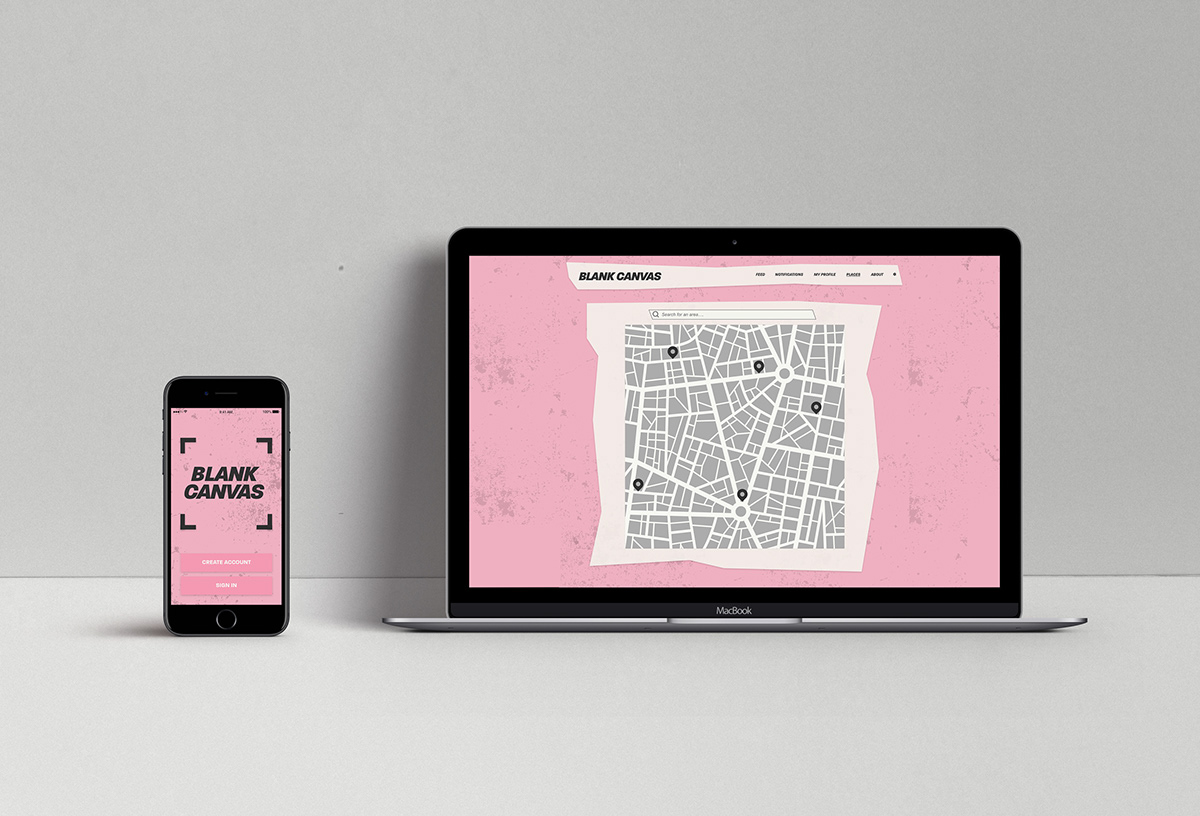
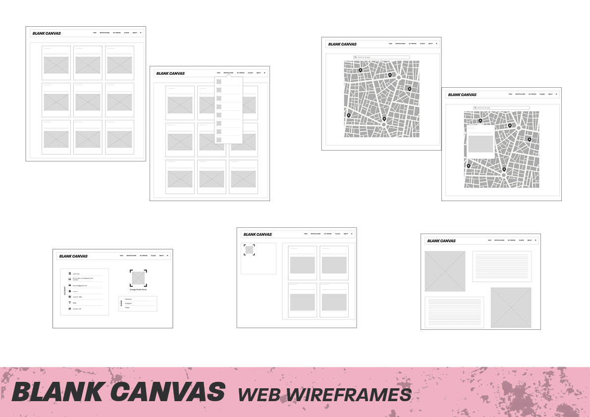
WEBSITE
CONCEPT
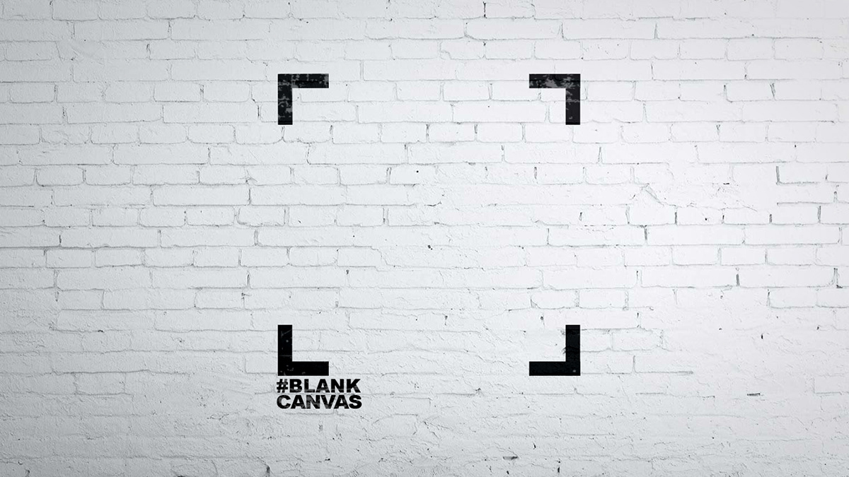
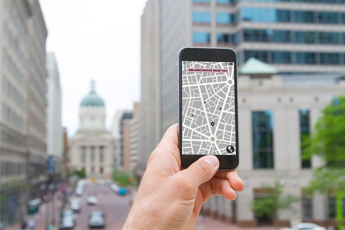
Crop marks represent the Blank Canvas campaign, as it is a visual illustration of what the app allows you to do. ‘Cropping’ bad advertisements out of the world by making them blank. This theme was continued throughout the campaign and the crop marks are now a part of the visual identity of Blank Canvas.
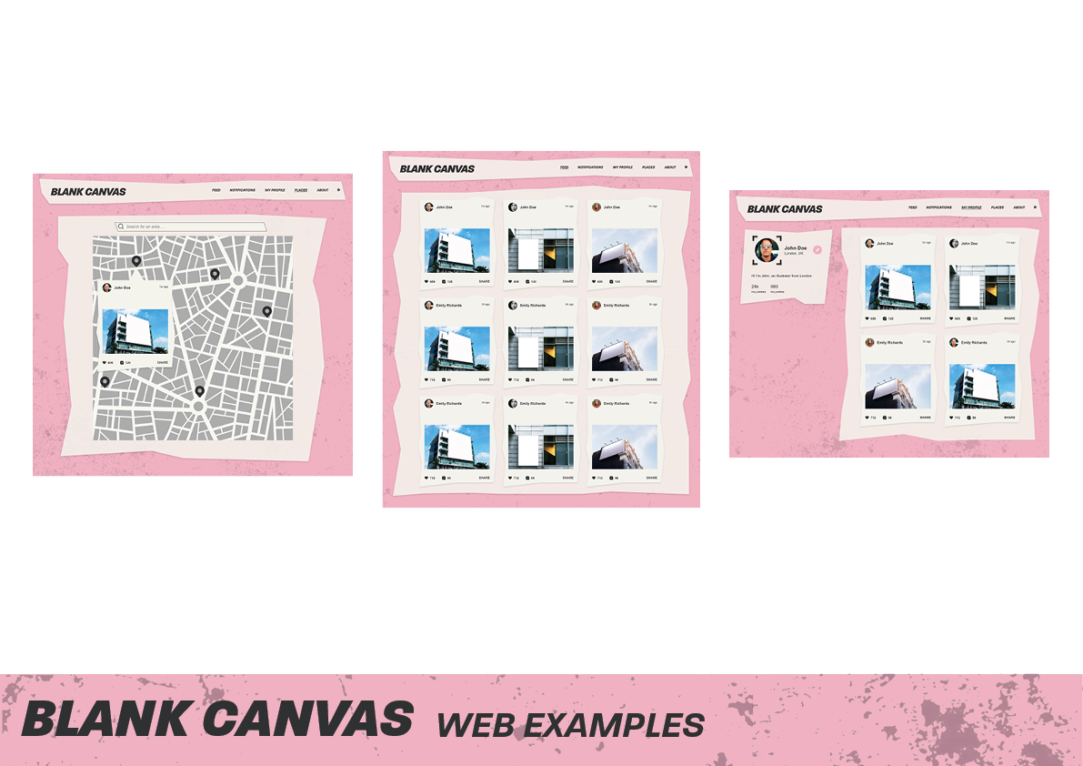
Drawing inspiration from the 1990’s Riot Grrrl movement, the colours used represent punk and protest culture. Along with Riot Grrrl, zines from the early 80’s helped in obtaining key colours to work with. The colours have been kept generally genderless purposely, the contrasting pinks and greens send a strong message.
The visual language featured within the Blank Canvas app and website also drew inspiration from earlier zines, as messy, textured backgrounds and ripped pages were commonly featured.